Work NW Brand Submission

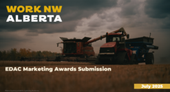
Work NW Alberta
Award Submission: Brand Identity
Purpose of the Brand
Work NW Alberta was established to meet a regional challenge: workforce attraction and retention in Northwest Alberta. Recognizing the need for a unified, intermunicipal approach, five key partners—the City and County of Grande Prairie, MD of Greenview, Grande Prairie & District Chamber of Commerce, and Northwestern Polytechnic—came together to create a single, compelling brand identity.
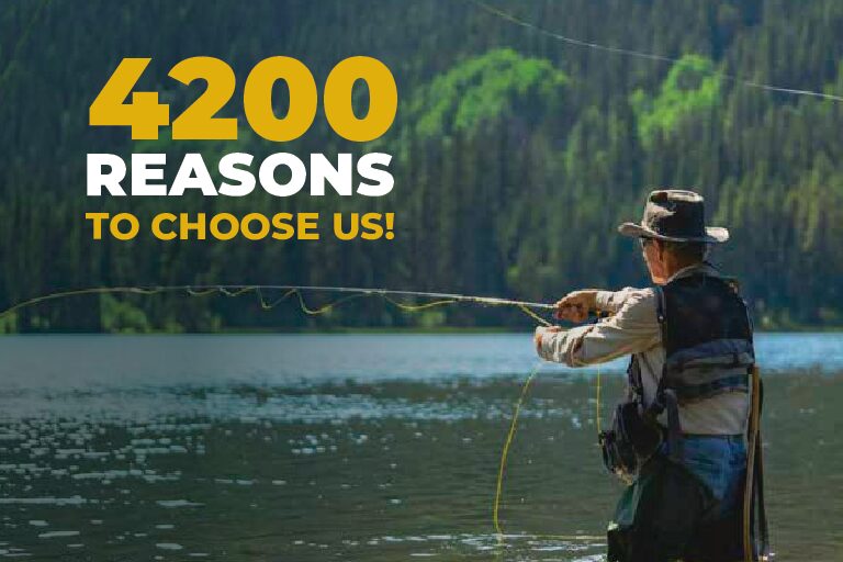
The brand’s purpose is to convey a powerful value proposition to jobseekers: “Make a Great Living. Live a Great Life.” It reflects the region’s economic opportunity, quality of life, and sense of community. The brand was designed to resonate with diverse audiences—tradespeople, professionals, students, immigrants, and families—while standing apart in a competitive national labor landscape.
Creative and Consistent Brand Identity
The brand is built on four core elements:
- Logo: A bold, modern typographic mark combining “Work NW” with a geographic arrow motif—symbolizing direction, ambition, and regional strength.
- Tagline: “Make a Great Living. Live a Great Life.” Simple, memorable, and grounded in real regional advantages.
- Color Palette & Typography: A bright, confident palette with professional sans-serif fonts designed for accessibility, legibility, and versatility across digital and print.
- Brand Promise: To position Northwest Alberta as a region where opportunity meets quality of life—and where workers, families, and businesses thrive.
A full brand guideline document governs logo use, minimum size, color codes, accessibility standards, and tone of voice. These guidelines have ensured uniform application across all partner channels and platforms.
Application Across Media
The brand has been applied across a wide range of media, maintaining strong visual and thematic consistency:
- Website (www.worknwalberta.ca) – The region’s centralized workforce portal integrates brand visuals, language, and tone across every page.
- Social Media – Facebook, Instagram, and LinkedIn campaigns have reached over 2.49 million people with branded ads, employer spotlights, and lifestyle content.
- Videos – A suite of recruitment and promotional videos featuring real regional employers and workers, generating over 1.3 million views.
- Print Materials – Job fair banners, brochures, and recruitment packages all reflect the brand identity.
- Sector Profiles – Professionally branded PDF reports showcasing regional labor opportunities in health care, energy, forestry, and more.
- Trade Show Materials – Pull-up banners, print ads, and booth design reinforce the brand across external engagements.
Sustainability of Brand and Message
The brand is designed for long-term use and local ownership. It avoids one-off slogans or seasonal themes in favor of a timeless, place-based identity. The messaging emphasizes community resilience, affordability, and opportunity—all aligned with sustainable rural development values.
Materials are produced digitally where possible. Print assets are localized and reused across events to reduce waste. Most importantly, the brand inspires positive community perception by reinforcing pride, potential, and partnership.
Conclusion
Work NW Alberta’s brand identity is more than a logo—it’s a regional platform. It is creative, consistent, and collaboratively applied. Through disciplined application and strong community resonance, it is already shaping how the region is seen—and how it sees itself.